Website Master Layouts Chart: Printable Page Layout Patterns
Starting a page from a blank file is the slowest way to build a website — you spend hours nudging divs around when a proven pattern would have answered the structure in seconds. Professional designers never start from scratch: they reach for a small set of master layouts that millions of tested pages already rely on, because each pattern exists to solve one specific problem — selling, explaining, comparing, or documenting. Pick the wrong pattern and visitors leave confused; pick the right one and the page almost designs itself. This printable master layouts chart covers twelve essential website layout patterns with their structure, what each is best for, and the modern CSS technique that builds it. Check the table below before you wireframe, or print the sheet below to keep beside you while you code.
Quick-Reference Table
The full data from this cheat sheet, right on the page.
| Layout Pattern | Structure | Best For | CSS Technique |
|---|---|---|---|
| Single-Column | One vertical stack: header, sections, footer | Blogs, articles, mobile-first pages | max-width + margin: auto |
| Two-Column Split | Text beside image, 50/50 | Landing pages, feature stories | Flexbox (two flex: 1 items) |
| Three-Column Grid | Three equal columns of cards | Services, products, pricing tables | Grid: repeat(3, 1fr) |
| Left Sidebar | Fixed nav column + main content | Docs, dashboards, blogs | Grid: 240px 1fr |
| Right Sidebar | Main content + complementary rail | News sites, blogs, profiles | Grid: 1fr 300px |
| Full-Screen Hero | Large headline + CTA over imagery | Homepages, product launches | min-height: 100vh, flex center |
| Alternating Split | Image/text sides swap each section | Feature tours, how-it-works pages | Flexbox + nth-child order swap |
| Card Grid | Repeatable cards that reflow | Portfolios, shops, testimonials | Grid: repeat(auto-fit, minmax(280px, 1fr)) |
| Magazine | One lead story + smaller grid below | Editorial, news, magazines | grid-template-areas |
| Sticky Header | Fixed nav + anchor-linked sections | Long docs, one-pagers, FAQs | position: sticky; top: 0 |
| Z-Pattern | Headline top, diagonal scan to CTA | Marketing landing pages | Full-width sections, big CTA buttons |
| Dashboard | Fixed sidebar + widget grid | Apps, analytics, admin panels | Grid + sticky sidebar |
How to Use This Chart
Pin this chart where you work: it packs 12 entries and 4 columns (Layout Pattern, Structure, Best For, CSS Technique) into one printable page, built for quick lookups.
Scan down the Layout Pattern column to your item, then read across for Structure, Best For, CSS Technique.
Example: for Single-Column, the chart gives Structure of One vertical stack: header, sections, footer.
- Compare values down a single column to spot the pattern before you commit to a choice.
- When two rows look close, the last column usually breaks the tie.
- Print it once and keep it where you work — that's the whole point of a cheat sheet.
💡 Quick Tips
Start Mobile-First: Design the single-column stack first, then add columns at larger breakpoints. If a layout fails when collapsed to one column, it was never sound.
Cap Line Length: Text columns wider than about 70 characters are hard to read. Give your main column a max-width and let the sidebar take the rest.
One Layout Per Job: Mixing hero, magazine, and dashboard patterns on one page confuses visitors. Pick one master pattern per page and let components do the variety.
Frequently Asked Questions
Which website layout should I use for a business homepage?
Start with the full-screen hero: one headline, one supporting line, one call to action. Below it, use an alternating split for features and a card grid for testimonials — the most tested homepage recipe.
How do I make these layouts responsive?
Stack columns at a breakpoint around 768px: multi-column grids collapse to a single column, and sidebars either move below content or become off-canvas drawers on mobile.
What is the difference between a layout pattern and a CSS framework?
A pattern is the structural idea — like a left sidebar — while a framework like Bootstrap or Tailwind is the code that builds it. Patterns guide decisions; frameworks speed up the build.
Printable Sheet Preview
High-Contrast Layout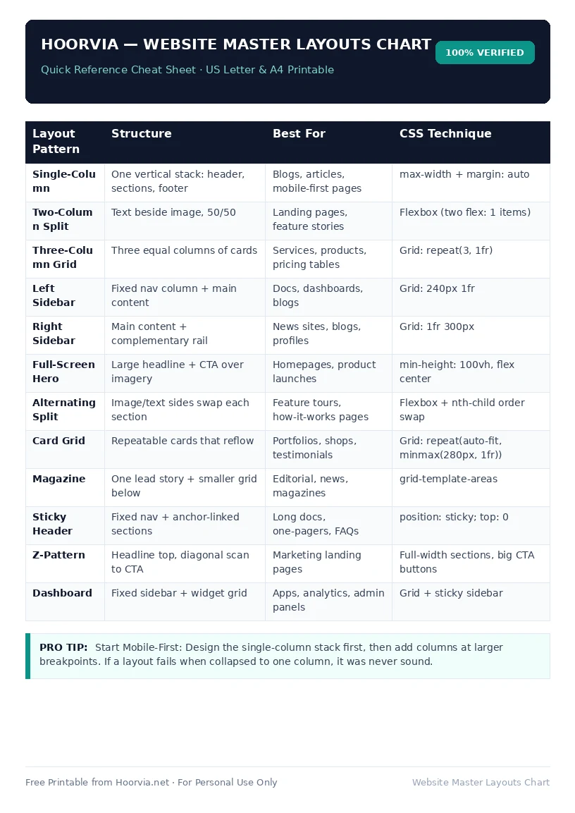
Download Your Free Printable Sheet
Download the printable PDF below. It is the same sheet shown in the preview above, ready to print on US Letter or A4 — open it and choose Print, with Scale set to Fit to Page.
💡 Pro Printing Tip: In your printer settings, set Scale to “Fit to Printable Area” and enable “Background Graphics” for color headers.