CSS Media Queries Cheat Sheet: Printable Responsive Guide
Responsive design breaks in one predictable place: the media queries. A site looks perfect on a laptop, then collapses on a phone because someone used a max-width where a min-width belonged, or hardcoded pixel breakpoints that miss half the devices on the market. The syntax itself is small — @media, a feature, a value — but the decisions behind it are not: which breakpoints to use, when to target orientation or dark mode, and how to handle devices without a mouse. This printable CSS media queries cheat sheet puts twelve essential query patterns on one page: the standard width breakpoints, orientation and dark-mode queries, reduced-motion and print handling, and high-DPI targeting. Check the live table below the next time a layout breaks on a device you don't own, or print the sheet below and keep it where you write CSS.
Quick-Reference Table
The full data from this cheat sheet, right on the page.
| Media Query | Targets | Use Case |
|---|---|---|
| @media (max-width: 767px) | Phones | Base mobile layout adjustments |
| @media (min-width: 640px) | Large phones, small tablets | Widen columns and increase type size |
| @media (min-width: 768px) | Tablets and up | Two-column layouts, visible nav |
| @media (min-width: 1024px) | Laptops and desktops | Full multi-column grid |
| @media (min-width: 1280px) | Large desktops | Max-width content containers |
| @media (orientation: portrait) | Vertical screens | Stack content, bigger tap targets |
| @media (orientation: landscape) | Wide screens | Side-by-side layouts |
| @media (prefers-color-scheme: dark) | Dark-mode users | Dark theme color overrides |
| @media (prefers-reduced-motion: reduce) | Motion-sensitive users | Disable or soften animations |
| @media (hover: hover) | Mouse and trackpad devices | Hover effects are safe to show |
| @media (print) | Printed pages | Hide nav and ads, black on white |
| @media (min-resolution: 2dppx) | Retina and high-DPI screens | Serve sharper images and icons |
How to Use This Chart
Pin this chart where you work: it packs 12 entries and 3 columns (Media Query, Targets, Use Case) into one printable page, built for quick lookups.
Scan down the Media Query column to your item, then read across for Targets, Use Case.
Example: for @media (max-width: 767px), the chart gives Targets of Phones.
- Compare values down a single column to spot the pattern before you commit to a choice.
- When two rows look close, the last column usually breaks the tie.
- Print it once and keep it where you work — that's the whole point of a cheat sheet.
💡 Quick Tips
Go Mobile-First: Write the base styles for phones, then add min-width queries upward. It keeps CSS smaller and fixes the 'max-width maze' for good.
Test at Breakpoints: Resize your browser slowly through each breakpoint instead of jumping between devices — you'll catch the layout cracks in between.
Respect Reduced Motion: Wrap every animation in prefers-reduced-motion: reduce. It's one query that makes your site kinder for thousands of visitors.
Frequently Asked Questions
What are the most common CSS breakpoints?
The practical set is 640px (large phones), 768px (tablets), 1024px (laptops), and 1280px (desktops). Use min-width queries so styles stack upward. Frameworks like Tailwind use exactly these values, which is why they feel familiar.
Should I use min-width or max-width in media queries?
Prefer min-width with a mobile-first approach: write the small-screen styles first, then add min-width queries for larger screens. Max-width works for desktop-first code but creates overlapping rules that are harder to maintain.
Can media queries detect dark mode?
Yes — @media (prefers-color-scheme: dark) matches when the user's OS is in dark mode. Use it to override colors, swap images, and soften heavy shadows, so your site adapts without any JavaScript.
Printable Sheet Preview
High-Contrast Layout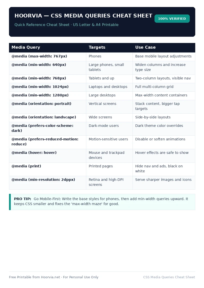
Download Your Free Printable Sheet
Download the printable PDF below. It is the same sheet shown in the preview above, ready to print on US Letter or A4 — open it and choose Print, with Scale set to Fit to Page.
💡 Pro Printing Tip: In your printer settings, set Scale to “Fit to Printable Area” and enable “Background Graphics” for color headers.